Kibsons Essential Oils
-
The essential oil market was oversaturated with organic, wellness-focused brands that all looked virtually identical - featuring earthy tones, hand-drawn botanicals, and minimalist typography. This created a sea of sameness on retail shelves, making it nearly impossible for new brands to stand out or connect with consumers seeking a more distinctive, personality-driven aromatherapy experience.
-
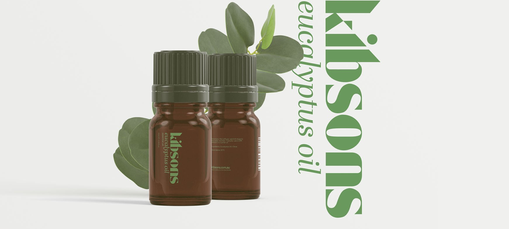
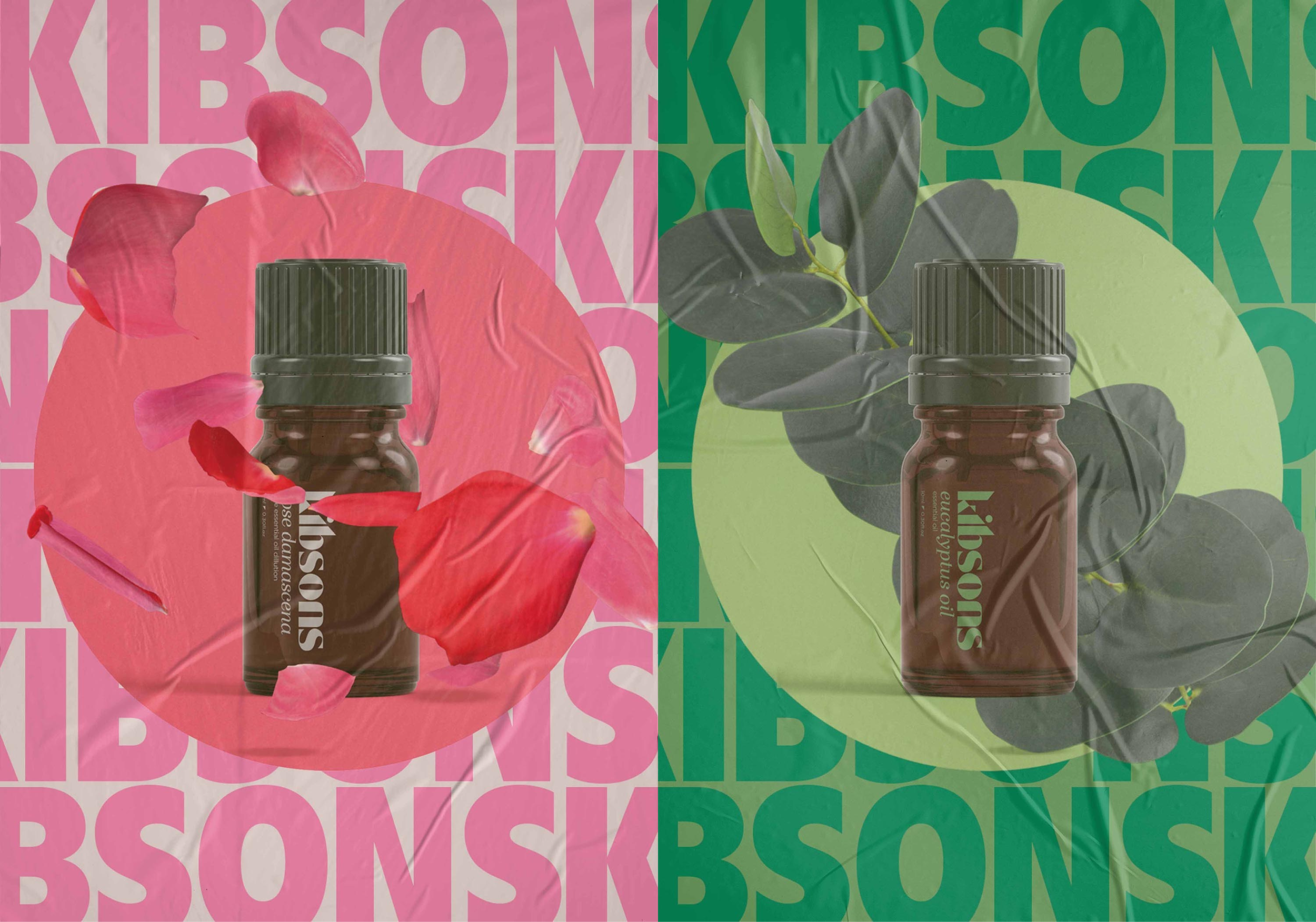
I developed a complete brand identity that deliberately broke away from category conventions by embracing a nostalgic 70's aesthetic updated for modern consumers. This included designing a distinctive wordmark, custom bottle design, and comprehensive visual language that celebrated retro charm while maintaining contemporary sophistication. The brand positioning focused on evoking memories and emotions rather than purely functional wellness benefits.