TGI Fridays
-
TGI Fridays is a brand built on fun, flavour, and bold personality, but somewhere along the way, it lost its spark. During my time as Art Director, I saw first-hand how inconsistent visuals and tired systems were getting in the way of great ideas. The challenge was clear: how do you bring back the energy without starting from scratch?
-
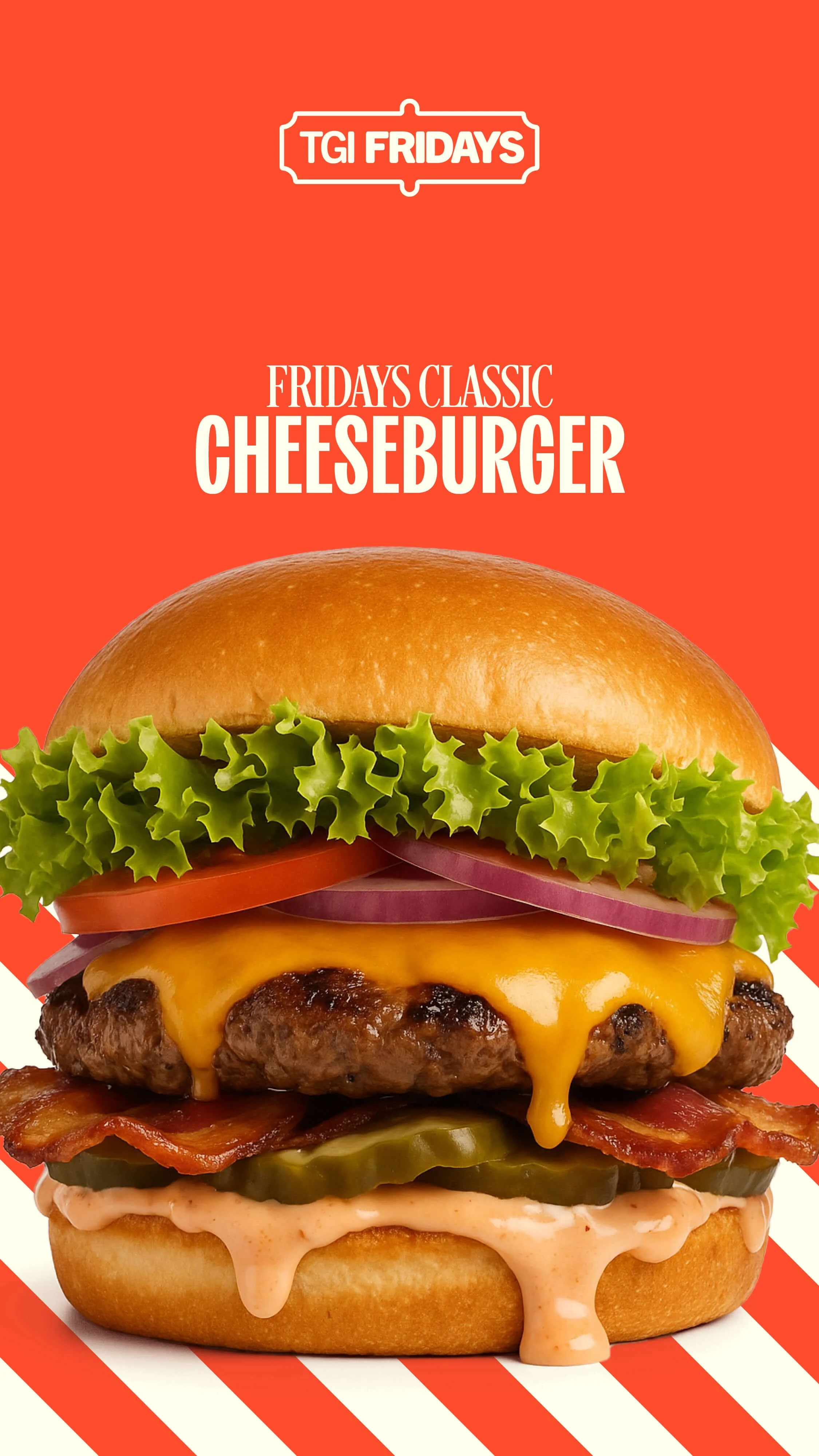
This speculative rebrand reimagines Fridays by reconnecting with the parts of its identity that made it iconic in the first place. I embraced the brand’s rich history: the stripes, the badge, the boldness, and brought them forward with a fresh perspective. The design system introduces a more approachable colour palette that lets the food and cocktails shine, without losing the soul of the brand. It is not about starting over, but about turning up the volume on what a Friday actually feels like. Fun, full of personality, and unapologetically itself.


-
TGI Fridays opened its first location on Manhattan’s Upper East Side in 1965. It was a single bar with striped décor, charismatic bartenders, and cocktails that felt like an event. It became one of the first bars in New York where women could go alone and socialize freely — a cultural shift wrapped in shaker tins and red bar stools. The vibe was irreverent, cheeky, and charming. It was Friday, every day.
This was the era when TGI Fridays was cool. Not fast food. Not family dining. Something looser. Louder. More alive.
-
The 90s were arguably peak Fridays. It was big, brash, and unmistakably itself. But cracks began to form. The now-iconic Office Space skewered the over-the-top “flair” culture, a critique so culturally sticky that it led to TGI Fridays eventually retiring flair altogether.
The brand, once ahead of the curve, started reacting to how it was being perceived instead of shaping its own story. A shift was beginning.
-
In pursuit of broader appeal, TGI Fridays began to sand off its edges. Uniforms were toned down. Décor was simplified. Menus expanded and blurred. The brand moved closer to casual dining competitors, chasing a sense of modernity but losing its distinctive sense of self.
In becoming more “acceptable,” it became more forgettable.
-
Without its original character, Fridays became just another option in a crowded dining market. Attempts at rebranding often misunderstood what people actually loved about it: the joy, the weirdness, the sense that you were somewhere, not anywhere.
It had stripped out its own heartbeat. Fridays felt like Monday with mozzarella sticks.